Friday, December 18, 2009

Roy Edward Disney


May Roy Edward Disney Forever be Loved & Remembered


(1930 ~ 2009)


"If you don't tell a good story... forget about it, you know ~ it's like real estate.
There's 3 important things about it, about film that's story, story and story...
and if you don't tell the stories...
well they've got someplace else to go pretty quick."

~ Roy E. Disney


Archive of American Television
AWN Article

Saturday, December 5, 2009

11 Second Club November 2009

PAAAAAAAAAAAAAAAAAAAAC MAAAAAAAAAAAAAAAAAAAAAN!!!!!

Woot 6th, again. Thanks for the votes and comments !


Initially was thinking of animating an alien in a cocoon, so I did some character exploration sketches, the bandaged dog with the cone of shame was in
spired by my own dog which had an ear infection and had to wear that cone, the other reason was to limit the animation to just facial.


I ended up going for Pac Man because I had one week to play around and I wanted something simple to animate as well as practice more on facial animation especially the mouth area, so what better character than a round sphere with his jaw half his whole body mass.

Also wanted to experiment gesturing with a simple sphere, it's limited but you'd be amaze with just some squash, stretch, tilting and timing of the sphere, one can portray some simple body expression of deflated, disbelief sadn
ess and directness, add it with a pair of eyes and a mouth and viola, you have facial gesturing.


Also experimented on f
ull motion distortion and distorted eye darts, I thought it would go horribly wrong but it came out quite alright I guess, except for some places....... but that's for you guys to find out :)

Crits & Comments are most welcomed.

Enjoy!


Final Animation for now....
~~~~~~~~~~~~~~~~~~~~~~~~~~~~~~~~~


Break Down!
~~~~~~~~~~~~~~~~~~~~~~~~~~~~~~~~~


By the way the collaborated Pac Man skeleton sculpture is created by;

Le Gentil Garçon
François Escuilié (paleontologist)


~~~~~~~~~~~~~~~~~~~~~~~~~~~~~~~~~~~~~~
Some of the more constructive comments & critics by 11second club members;

Kashif:

"Haha Packman addicted to the cream. Wow. Great concept and wonderful lipsync. I love the weight shifts on Packman. In fact, after noticing this I wished you made the Ghosts shift their weight when they looked at each other. Either way, tops in my book."


Ryan Hayford:

"The expression in this is excellent, and the reveal is great. I thought this was gonna be a talking head facial animation excersice and then the ghosts jumped in... maybe you could have given more backround, like more dots or part of the maze so we know right away it's pac-man."


Justin West:

"Wow, that's some really impressive 2D! Very bouncy and expressive! The only thing that didn't look quite right to me was the sobbing at the beginning. I'm not sure what it is. Maybe there's movement in the mouth, I don't know. Sorry I can't be more specific. Great work, otherwise! I won't be surprised if this wins. The ghosts are a great touch, btw!"


Robert Holmen:

"No cliched arm gestures in this one! extra star for that.

This is a great study in just "face"

Some of the gestures seem not to be timed quite right, like the last one for "whipped cream"


Jett Atwood:

"Finally! Something original! Great idea, well drawn. My only suggestion would be to layer the ghosts blinks a little bit. It's jarring to have them blink at the *exact same time.*

Great stuff and shows that good character animation can be done with something as simple as a sphere."


Emmanuel Vergne:

"The lipsync seems off."


*Note; I'm not 100% sure if the name links are linked to the right people, if it isn't please let me know immediately, thanks!


Thanks again for all the C&C you guys gave, I've read them all and just posted these selected few for readers and me who want to learn more on what works and what not.

Till the next round, December's clip sounds WILD!

Friday, December 4, 2009

Pogo

I don't think I've posted this on here before but it was something I came across a few months back, music created by Pogo.

So, for all you Animators who loves chillout lounge music;


Alice


Expialidocious


White Magic


Thursday, November 26, 2009

P A N T U R A L

Some wicked stuff by PANTURAL.

Ford SHELBY vs CAMARO vs JEEP vs VAZ 2107 vs HELICOPTER


Get the 720 x 405 version here.

Sunday, November 22, 2009

A Town Called Panic

A film by Stéphane Aubier & Vincent Patar

"A Town Called Panic is one of the rare full-length animated films ever to secure the honor of a coveted slot in the Official Selection (in this case, Out of Competition) at Cannes."


A Town Called Panic

Wonder if it'll ever be screened here.....

Friday, November 13, 2009

6 Degrees of Separation

Here's a question;

Bambi
(1942)


The Banyan Deer
(1957)


Hikayat Sang Kancil
(1978)


?


They just might have more in common than you think....

Saturday, October 31, 2009

A Train of Thoughts...


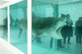
Was watching Hustle the other day, great BBC tv series about con men. Anyway the thing that caught my attention in the Designer's Paradise episode was the antagonist fashion designer reasoning about Charles Saatchi and a tiger shark in a tank which sold for 8mil. The name Charles Saatchi rang a bell as I recalled an ad agency named Saatchi & Saatchi wasn't sure if they were related. So what did this guy and a tiger shark in a tank and $12 million had to do with fashion/art.

Charles Saatchi was co founder with brother Maurice of the leading global advertising agency Saatchi & Saatchi. He is also known as an art collector and established the Saatchi Gallery in 1985. Charles Saatchi developed a strong interest in US pop culture during his early years in secondary school and had a strong enthusiasm for collections of Superman comics to Jukeboxes.

In 1991 Charles Saatchi commissioned Damien Hirst for whatever artwork he wanted to create, thus the creation of "The Physical Impossibility of Death in the Mind of Someone Living" ~ a 14ft Tiger shark preserved in a tank filled with formaldehyde, total cost of work was £50,000. On December 2004 Charles Saatchi sold it to an American collector for $12 million (£6.5 million).

Damien Steven Hirst dominated the art scene in Britain during the 1990's, world renowned and reputed to be the richest living artist to date. His career in the 90's was closely linked with art collector Charles Saatchi whom commissioned him to create;


...which evidently became an iconic work o
f British art in the 90s and Brit Art world wide. Death is one of the themes in Damien Hirst's work, in which he was famous for a series of dead animals preserved in and sometimes dissected in formaldehyde.


Although he physically participated and the making of his earlier works it came to a point where the volume of work produced would requ
ire a factory setup where assistants will execute his ideas like a film director molds a film with the help of actors and a crew. Damien Hirst work philosophy wasn't much different than of Andy Warhol's that a legitimate art piece isn't the execution but the ideas and subject matter envisioned by the artist himself whom his assistants could execute it even better for him.

Andrew Warhola more so known as Andy Warhol was leading figure in the Pop Art movement in America of the late 50's. He had a successful career as a commercial illustrator and was later recognized as a painter, filmmaker, record producer, author and a public figure. His studio dubbed The Factory was a place where he worked and to setup an assembly line for the mass production of his silkscreen works as well as a place a where prominent people hung out and the setting for most of his film making with the workers who doubled as actors.

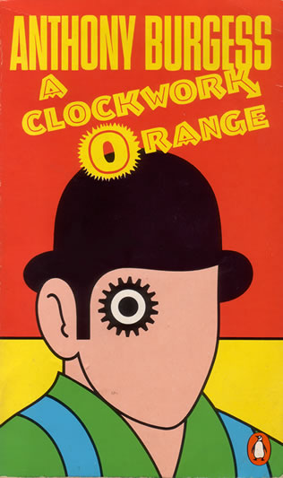
Though more known as the Pope of Pop in the pop art movement for his works of Marilyn Monroe silk screen prints and Campbell Soup Can paintings, he was quite an underground filmmaker due to the controversial, explicit, abnormal films he made and the reason why it remained underground as non of the theaters wanted/could show them as for those that did usually got raided. Of such films, his 1965 film ~ Vinyl was a BWhite experimental film early adaption of the novel "A Clockwork Orange" by Anthony Burgess.

John Burgess Wilson (pseudonym Anthony Burgess), an accomplished musician, author and linguist. Most known for his novel "A Clockwork Orange" which was adapted into film by Andy Warhol in 1965 and later in 1971 by Stanley Kubrik. The title of the novel came from an old Cockney expression, "as queer as a clockwork orange" and thought he could use it punningly to refer it to a mechanically responsive human due to his time in Malaya as a teacher and education officer for the British Colonial Service in 1954.

John Burgess Wilson was stationed at Kuala Kangsar, Perak and taught at the Malay Residential School, established in 1905 the first fully residential all boy all Malay prep school dubbed Eton of The East, founded by Mr R.J.Wilkinson and headed by then the headmaster of Penang Free School, Mr W.Hargreaves. Besides the languages German, Russian, French and Spanish, John Burgess Wilson was fluent in Malay speech and Jawi writing. In addition to his teaching duties he had responsibilities as a housemaster in charge of the students who were housed at a Victorian mansion known as the King's Pavilion.

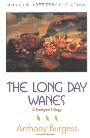
He devoted some free time to creative writing during his stay in Malaya and published his first novels ~ Time for a Tiger, The Enemy in The Blanket and Beds in The East was known as the Malayan trilogy and later published under a single volume The Long Days Wanes. In 1956, John Burgess Wilson composed the symphony ~ "Sinfoni Melayu", which draws on many musical styles he encountered while he was in Malaya, he described is as an attempt to "combine the musical elements of the country into a synthetic language which called on native drums and xylophones".


...End of the Line

Friday, October 30, 2009

What if they were real?

An article I read from my cousin's twit on Michael Paulus and his anatomy studies on cartoon characters.


Wednesday, October 7, 2009

6th Place, Thank You!!!!!

Woot! I was not expecting to get anywhere near top 10 with this entry, but thank you all for your votes critics and comments for 6th place!


Thumbs and sketches

Last months entry took me about a month to complete, I haven't done a proper 2d for so long that it took me a w
hile to get use to the x sheet and all. And true to what I found out is that the x sheet really helped out in the timing and the lip sync as well as reduce that overwhelming feeling of endlessly drawing frames, the more you draw the less empty frames left to draw which you could visually count on the x sheet :)

Most importantly what I learned is that the amount of exaggeration you could pull off in an animation, well in 2d I felt that I wasn't restrained to rigs wh
ich felt liberating and just draw out where and how you want the character to move. And the more exaggerated I made the animation the more lively and fleshy it became. When I started off for the first half of the process most of my posses were very very stiff to the point of limited animation and animating just the head, during the second half of the process I decided to just go all out and apply more SQST all round and really squash that face and then stretch it in a way that it's grotesque and imagining it to fail miserably...... that part of the animation came out to be the best stuff of the whole clip.


The thing that made it so fun to watch was not because you could see the really squashed and stretched face but the overall feeling of it being really elastic and fleshy in sequence because of the exaggerated posses or shapes of a character. After all, those frames passed by 1/25th of a second each. It felt really squishy and pliable giving it more realism in a way to the character that her face was a real fleshy face.

Could have worked better with the overlapping of hair and cloth as well as volume and on model control, if you go frame by frame you can see the chin grow bigger and then smaller when she stands back up. Could have explored more with facial expressions as well. The second bang SFX in the clip was added in after and not from the original audio clip. I just felt like animating her slam her fist on the book and didn't really cared if there wasn't any audio for it.

Final Animation
~~~~~~~~~~~~~~~~~~~~~~~~~~~~~~

~~~~~~~~~~~~~~~~~~~~~~~~~~~~~~


Work Progression
~~~~~~~~~~~~~~~~~~~~~~~~~~~~~~

~~~~~~~~~~~~~~~~~~~~~~~~~~~~~~


It was a fun month to animate, killed 2 blue pencils though.

Tuesday, October 6, 2009

Insight of A TV Show

Was surfing The Tube, and watching interviews of cast members of House.

Then I came across this channel ; The Paley Center for Media, which has tons of on stage interviews with TV related shows and the directors, script writers, producers and actors, discussing about the process and behind the scenes, what goes into the writing scripts, character build up, acting choices and how it's delivered.

Below are just some of the stuff available for your viewing pleasure.


Prison Break - Robert Knepper on T-Bag


House - Hugh Laurie & Jesse Spencer on Inflections

Saturday, October 3, 2009

2D

Last month I decided to take out my really old old old old old old old old old old old old old old old old old old old old old old old old ...... old .... stack of punched B4 animation paper and have a go at it, was wondering if I still knew how to do 2d after working on 3d for so long. The other reason was that I was too lazy to mod Norman into an old hag for Septembers 11 sec competition and thought ~ "Hey, here is a great opportunity to see how badly I'll fail in 2d" :)


~Mee make shift light table, got a back ache after a few days of hunching over it....

Anyway it took awhile to work out the work flow and how to tie it to the x~sheet and a while longer before I got used to drawing . Used Premier to get the audio timing using frame count instead of the usual time counter, jotted down the audio on to the X~sheet and worked on the Roughs.

Took a month to work things out, a wee bit too long but it was sure fun and for some reason relaxing inb
etweening those drawings though really tedious.... but relaxing. Also found out that you could really get away with very exaggerated posses Squash and stretch, crazy distortion poses which I would never/couldn't have done in 3d, I should look into that and see how far I can push Norman before he breaks.... sounds sadistic.


~What a 150pcs
stack of B4 paper look like :)

Anyway will go through the whole 2D Shabang in a few days time once the 11 sec results are out. Finally my hard~earned~manually~punched~half price~stack of B4 Animation paper put to good use
. Still 2 boxes to go......

Saturday, September 12, 2009

Aleksandr Konstantinovich Petrov

Animated pastel oil paintings on glass shot for IMAX. The following 20 minute animated short was adapted from the novel, "The Old Man and The Sea"


Aleksandr Konstantinovich Petrov

Friday, September 11, 2009

AmbiGram


Created by my Bro
, so proud :)

Sunday, September 6, 2009

11 Second Club August 2009

Great works this month and BJ Crawford won first place again with his amazing 2d work, check it out.

My work stands at 28th, average. And watching it now it just feels so dead, I need to find ways to inject it with some life...

Tuesday, September 1, 2009

Lady & The Tramp

Just watched Lady & The Tramp and I thought I'd share some thoughts about the creation and the wide screen format it uses on its original showing.

Some historical facts from watching the DVD making, the very first initial idea for this film during the early stages of story development was really conceived by Joe Grant inspired by his family pet dog a Cocker Spaniel. Unfortunately Joe Grant had a falling out with Walt Disney and left. By then the story still wasn't solid and Walt Disney got Ward Greene to write a novel treatment for it and adapted it for the feature. Joe Grant was not credited.

Lady & The Tramp is also an original story for a Disney animated feature. The previous features were either based from Fairy Tales or Novels.

Following up from watching Peter Pan, personally I believe the production quality for Lady & The Tramp was a step up not just from the animation point of view but from the layouts and Bground paintings. Having two dogs of my own it felt natural watching the dog characters of this film even though they talked like humans. The really strange time when it felt wrong was when the tramp imitated human facial emotions and motion but besides that the characters were still very believable as dogs. The Spaghetti Scene would never have made it in the film if Frank Thomas hadn't push for it, animated it and proved to Walt that audience would watch two dogs eating spaghetti in a romantic sincere setup.

During the 50's, TV sets were starting to be sold. The film industry thought TV was going to kill the cinemas, so.... wide screen and Cinerama formats was a way to give the audience a unique visual experience home TV's can't. Same reason for Stereographic films which nowadays we know it as ~ "Watch it in 3D!"

Lady & The Tramp is the first Disney feature to be shot in wide screen, probably the first animated feature in wide screen.

Due to the choice of shooting this film for Cinerama / wide screen, the panoramic landscapes just enhanced the mood and environment for the characters to play in. Even though the Bground is full of details it never did pull my attention away from the characters, using light and dark areas to compose and frame actions and situations.

Although the wide screen format enhanced a lot of the shots most of the time, there were some when the character was surrounded with a lot of empty dead space, it felt that the left and right field of screen wasn't utilized and were there just to fill the wide framing. One of the reason was because not all the cinema's during that period had Cinerama setups and still used the old full screen format, so during story development they had to re~plan the shots for both wide and full screen, thus some of the side framing in the wide screen versions felt unused. On the other hand in the full screen version, there would be elements and even characters cropped out of frame.

Great film to study layout designs.

Wednesday, August 26, 2009

Iron Man

What happens when you have a collaboration between Marvel with Mad House (One wicked Japan Anime Studio).

Friday, August 21, 2009

Was stumbling around Digg.com

.... and found Timon & Pumba


Hakuna Matatah

I'm Still Alive ..... if you're wondering

I know I haven't updated my blog for a while :) been reading and watching a lot of animation, and I was in a rut for a while (excuses), anywhoooo...

Uploaded some Old Old works I dug out from the past whom a friend asked for and to keep this blog alive for the next few weeks. Finishing off this months 11 sec. Later...

REX Turn Table


Walk Cycle


Stair Walk & Snap Exercises

Sunday, July 26, 2009

Pot Luck Practice 03 ~ Norman Gets Excited!


Had some animators block with this, I was going from one theme to another and back again but finally decided to stick to the TV one if I ever wanted to get this done.


Thursday, July 23, 2009

Just To Fill In the Gap

Haven't posted for some time so I thought I'll post up some imaginative creative works by other interesting mammals while surfing around till my next post.


Alex Trochut

A freelance artist into both Typography and Illustration, great use of graphical shapes as typo as well as the silhouette of a type for illustration and a jumble of both to create some of the most awesome graphical illustrious typography.

It's amazing how
just by using black you could create depth and texture through graphical lines and shapes, example for "10 ways", it's smooth and slick with oil like vinyl records, pieces of plastic layered on top of each other the flow of energy.


Vlad Artazov ~ Nail Series

Photographer from Czech Republic.

Actually crossed through his work through Victor Navone's blog, and like Victor said it's a great thing to study the staging, lighting and just the kinds of personality and character which a regular nail can portray.


Strange thing though, I find that the BWhite photos evoke a stronger emotion and believability that the nails are alive compared to the Coloured photos, maybe the colours just made it too realistic and not as impressionistic compared to the BW.


Anyway enjoy, till my next update.

Thursday, July 9, 2009

Pot Luck Practice 02 ~ Norman Moonwalks


It's strange how somethings come around in a odd karma~tic sorta way. Before going down to Singapore for CGOverdrive last month I picked out MJ Moonwalk from my pot luck practice and come 3 weeks later MJ passes away.

It was going to be such a cliche animation but either way it would be great to study MJ's illusion of walking while gliding backwards, so I pulled out my Double Gold Disc MJ History album and MJ's one and only Moonwalker the movie. Things I'd had to take care was to make sure it looked convincing and that Norman was doing a sliding walk and not just floating backwards and the other thing was to make it look as though it had the illusion of weightlessness while trying to maintain some sort of weight to the animation itself, which in a way is an oxymoron for animation principles.

Anyway here it is, any feed back would be appreciated.

Tuesday, July 7, 2009

11 Second Club June 2009


I just wanted to get my hands back into 2D and break away from 3D for a while. It was refreshing and interesting. Firstly, I'll admit that it's horrible, it's off model, lack of frames, generic posses etc.... but it was sure fun and a hell lot of work :)


Oh got 34th/137 position with an average vote of 5.38. June's competition has a lot of great 2D entries, check out the excellent 2D animation winner ~ BJ Crawford.

The only thing I think is the best part of the whole animation is the sleeve drapery, even then it's lacking on frames, on 3's mostly :) Lip Sync is out of the window so is the lack of expression and jaw. Because I was just going to do it without thinking too much, I didn't bother with an X~Sheet and just churned the whole thing out. Now I know why the X~Sheet is like sooooo important for 2D, without it it's just so hard to plan the amount of frames for motion and lip sync, you're like groping for the timing and just guessing where the mouth shapes should be placed. With an X~Sheet it would feel less work too I guess, there are just so many frames you have to draw locked off and its all planned out in the sheet compared to straight ahead the whole thing and wondering if you will ever get it done, it's like a never ending flow of empty frames.

Anyway enjoy my crappy 2D :)


Wednesday, July 1, 2009

Stop Motion from Space

A really interesting perspective of a volcano eruption from space.

Friday, June 26, 2009

Michael Jackson (1958 ~ 2009)

Sad and shocked, MJ have been a big part of my early childhood memories, the MTV's, music and dance moves. Many of his songs and lyrics have influenced me to be who I am today.

MJ, may you rest in Peace, Loved and Remembered.


Portrait: Michael Jackson, Textportrait von Ralph Ueltzhoeffer

Monday, June 22, 2009

Movie Studies - Joe Wright ~ Pride & Prejudice (2005)

~~~~~~~~~~~~~~~~~~~~~~~~~~~~~~~~~~~~~~~~~~~~~~~~~~~~~~~~~~~~~~~~~~~~~~~~~~~~~~~~~

SPOILER ALERT

Study notes consists of spoilers and story plots.

Overall a comfortable drama romance period film.


~~~~~~~~~~~~~~~~~~~~~~~~~~~~~~~~~~~~~~~~~~~~~~~~~~~~~~~~~~~~~~~~~~~~~~~~~~~~~~~~~


Based off the romance novel ~ Pride & Prejudice written by Jane Austen (1775 ~ 1817)


~~~~~~~~~~~~~~~~~~~~~~~~~~~~~~
Elizabeth's Ignorance Guilt Scene
~~~~~~~~~~~~~~~~~~~~~~~~~~~~~~

I chose to breakdown this scene mainly because of the dark gloomy mood created by a series of well planned and framing camera shots. There was also a very disturbing/uncomfortable shot with time lapse which was really a well used contemporary cinema photography, to create the dark mood.

Most of the camera angles used were profiled to a wall or down a corridor, it wasn't unti lthe turning point was a 3/4 framing used, the profiles helped create the solemn, lonely mood and flatness.


SH01 ---> SH04, Total length 1min 34sec, averaging 23sec/shot. Usually when you have long takes it's to heighten the sense of drama or to reveal a series of continuous events. In this case the 4 shots comprising of only Elizabeth and her slow moody movements was to create the sense of lost, loneliness, sadness and distraught. A very moody scene of nothingness and emptiness. The angles used just made the scene even more atmospheric solemn , the use of profile angles, corridors and shallow focus. From SH01 to SH04, the camera was always tangent to wall behind Elizabeth or shooting down a corridor, everything was flat and linear. Even the movement of the camera was flat, either tracking left right front back, crane up down, the linear movement from point A to B, it just flattens out Elizabeth's senses like there was nothing left for her to feel or do. The use of anti framing Elizabeth made the composition less balanced.

SH02, Elizabeth walks down the corridor with a shallow focus camera which enhanced it more with rack focus. It made the shot dreamy , as though Elizabeth was walking down a tunnel of a dreamy thought and then fading deeper and deeper, engulfed in her thoughts.

SH04, At first impression it would give out a slight shock for the audience as Elizabeth seems to be staring straight at the audience, but actually its the point of view shot of Elizabeth looking at herself in the mirror. The initial shock was in a way to create an eerie feeling as well as set the emotional mood as Elizabeth looks at herself, studying her own emotions and thoughts. This kind of shot also allowed another contemporary cinematography to be added; Time lapse. After the initial shock, the audience will notice the sudden shift of shadow and lighting as though Elizabeth is in a state of suicidal lost of life, distraught and despair falling deeper and deeper in her emotional breakdown..... and then suddenly Mr. Darcy walks into screen. It's as though this was the wishes of Elizabeth to see Mr. Darcy there in her mind, to explain and comfort her. Even Elizabeth was doubting herself if what she saw was her own imagination.

SH04, Maybe for general audience the shock was of Elizabeth staring back at them but for some they might be more baffled on how technically possible it was to have shot Elizabeth at that angle without having the reflection of the camera in the mirror. My theory is that the camera was situated behind the mirror Elizabeth was facing and shooting through a duplicate frame from behind the wall. After that the negatives were mirrored in editing and viola, invisible camera.

SH07, I'm not sure if this shot could be considered as a 180' flip or just a cut shot, either way I'm going with 180' flip. The use of the mirror to create a sense of inner reflection and then cut to a frontal shot and breaking the 180' line was in my opinion a genius use of the 180' rule. On one hand you have Elizabeth looking at herself and studying her own emotions, deep and psychological unnerving and then cut to a shot of her contemplating what she thought she heard and saw when Mr. Darcy left. It's a sudden change and contrast of the unsettling emotions and the realization of Elizabeth and what she had done to Mr. Darcy.

SH10, Up until SH10 all previous shots have slow motion and slow energy. On contrasts SH10 is fast paced, high energy and the rush of Mr.Darcy riding vigorously through the forest, the camera itself tracking Mr. Darcy is blazing past bushes and trees. The main reason for SH10 was to setup a turning point not just in this particular scene with Elizabeth but a main turning point for the whole story line of Pride & Prejudice, a mid peak and climax. It's to reveal whom Mr. Darcy truly is, the protagonist and how the situation of all the characters stand. The emotional guilt of Elizabeth and how she had dishonor Mr. Darcy from her own ignorance, pride and prejudice. The rush and speed of the energy in this shot also portrays the emotions of both Mr. Darcy and Elizabeth is going through; for Elizabeth the revealing of how wrong she was and Mr. Darcy's fury, anger and sadness. It also helped to setup a very strong contrast for the following shot of Charlotte Lucas walks into the room while Elizabeth was reading her personal letter.


Overall the film was enjoyable to watch, the use of words and language, the fashion and societies of the Georgian era with a pinch of drama and romance. Best part was that there weren't tons of mushy gushy lip locking scenes, through out the film there was only 2.


Pride & Prejudice Complete Study Notes

Enjoy!