Ryan Woodward animates Google's header sketch in commemoration of Martha Graham ~ modern dancer.

Showing posts with label design. Show all posts
Showing posts with label design. Show all posts
Saturday, May 14, 2011

Sunday, May 1, 2011
Wednesday, February 9, 2011
The External World
This is just soooooo weird but A-W-E-S-O-M-E :)
A David Oreilly Film
The External World from David OReilly on Vimeo.
A David Oreilly Film
Thursday, January 20, 2011
Monday, March 1, 2010
Saturday, February 6, 2010
80's "Western Anime" & Cyber Formula




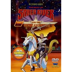
So... I was day dreaming childhood memories of cartoons I've watched when I was like 5 but never realized what they were about nor what they were called and they were just soooo cool!..... well back then. A pang of nostalgia hit me and I just felt like searching the intro to those "cool" 80's ~ **"Western Anime" cartoons such as Thunder Cats, Ghost Busters, Voltron, Saber Riders & The Star Sheriff, Robotech/Macross, Jem and Mask (the one's with big helmets and changing automobiles, not the green face guy). And the intros are still great to watch because most of the production money went into this 30 -40sec montage thus higher frame rate with cooler effects and opening theme song :)
**I don't really know what to call these cartoons because they weren't Warner Bros, Disney, Hanna Barbara nor anything similar to the limited Saturday cartoons and they do look and feel more like Anime, so I call them "Western Anime", was probably shipped to Japan to be animated anyway....
 Getting back to point ~ back when I was like 5, I also remembered a cartoon which had really cool 6 wheeled racing cars which could transform (anything that transformed was automatically cool when you're 5), so went Googling and found the anime. Cyber Formula is an Original Video Anime (OVA) which means it was created originally as an anime TV series, usually Japanese anime series are either based off existing manga or stories.
 The anime is about the young drivers, advancing technology in the cars and the racing sport which is similar to F1 except with really advanced technological vehicles installed with AI guidance and not forgetting the ridiculous Jet Boosters propelling the cars up to 600kph. The race cars themselves were cool but sort of strange and really outlandish to have a 4 to 8 wheeled steering/driving chasis and thought that it was just as a design appeal for the anime.... . . . . . . . . .
. . . . . . . . .... then I found these;


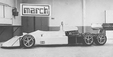


Apparently 6 wheeled F1 cars actually existed back in the 70's, they were experimenting on traction and steering control, you can read more about it on Forix as well as the following wiki articles;
Monday, January 4, 2010
Parkour Real Time 2D
Once in a blue moon I'd come across videos of these interesting and new experimental ways of utilizing the 2D medium. There was another one on a stop motion graffiti which I can't recall the name but it was pretty cool.
Enjoy :)
Enjoy :)
Saturday, October 31, 2009
A Train of Thoughts...
 Was watching Hustle the other day, great BBC tv series about con men. Anyway the thing that caught my attention in the Designer's Paradise episode was the antagonist fashion designer reasoning about Charles Saatchi and a tiger shark in a tank which sold for 8mil. The name Charles Saatchi rang a bell as I recalled an ad agency named Saatchi & Saatchi wasn't sure if they were related. So what did this guy and a tiger shark in a tank and $12 million had to do with fashion/art.
Charles Saatchi was co founder with brother Maurice of the leading global advertising agency Saatchi & Saatchi. He is also known as an art collector and established the Saatchi Gallery in 1985. Charles Saatchi developed a strong interest in US pop culture during his early years in secondary school and had a strong enthusiasm for collections of Superman comics to Jukeboxes.
 In 1991 Charles Saatchi commissioned Damien Hirst for whatever artwork he wanted to create, thus the creation of "The Physical Impossibility of Death in the Mind of Someone Living" ~ a 14ft Tiger shark preserved in a tank filled with formaldehyde, total cost of work was £50,000. On December 2004 Charles Saatchi sold it to an American collector for $12 million (£6.5 million).
Damien Steven Hirst dominated the art scene in Britain during the 1990's, world renowned and reputed to be the richest living artist to date. His career in the 90's was closely linked with art collector Charles Saatchi whom commissioned him to create;
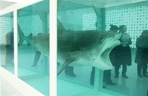
...which evidently became an iconic work of British art in the 90s and Brit Art world wide. Death is one of the themes in Damien Hirst's work, in which he was famous for a series of dead animals preserved in and sometimes dissected in formaldehyde.


Although he physically participated and the making of his earlier works it came to a point where the volume of work produced would require a factory setup where assistants will execute his ideas like a film director molds a film with the help of actors and a crew. Damien Hirst work philosophy wasn't much different than of Andy Warhol's that a legitimate art piece isn't the execution but the ideas and subject matter envisioned by the artist himself whom his assistants could execute it even better for him.
 Andrew Warhola more so known as Andy Warhol was leading figure in the Pop Art movement in America of the late 50's. He had a successful career as a commercial illustrator and was later recognized as a painter, filmmaker, record producer, author and a public figure.
 His studio dubbed The Factory was a place where he worked and to setup an assembly line for the mass production of his silkscreen works as well as a place a where prominent people hung out and the setting for most of his film making with the workers who doubled as actors.
Though more known as the Pope of Pop in the pop art movement for his works of Marilyn Monroe silk screen prints and Campbell Soup Can paintings, he was quite an underground filmmaker due to the controversial, explicit, abnormal films he made and the reason why it remained underground as non of the theaters wanted/could show them as for those that did usually got raided. Of such films, his 1965 film ~ Vinyl was a BWhite experimental film early adaption of the novel "A Clockwork Orange" by Anthony Burgess.
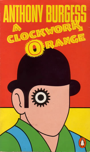 John Burgess Wilson (pseudonym Anthony Burgess), an accomplished musician, author and linguist. Most known for his novel "A Clockwork Orange" which was adapted into film by Andy Warhol in 1965 and later in 1971 by Stanley Kubrik. The title of the novel came from an old Cockney expression, "as queer as a clockwork orange" and thought he could use it punningly to refer it to a mechanically responsive human due to his time in Malaya as a teacher and education officer for the British Colonial Service in 1954.
John Burgess Wilson was stationed at Kuala Kangsar, Perak and taught at the Malay Residential School, established in 1905 the first fully residential all boy all Malay prep school dubbed Eton of The East, founded by Mr R.J.Wilkinson and headed by then the headmaster of Penang Free School, Mr W.Hargreaves. Besides the languages
 German, Russian, French and Spanish, John Burgess Wilson was fluent in Malay speech and Jawi writing. In addition to his teaching duties he had responsibilities as a housemaster in charge of the students who were housed at a Victorian mansion known as the King's Pavilion.
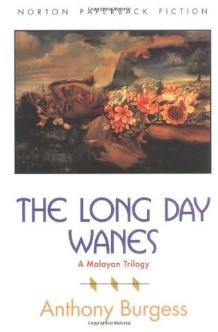
 He devoted some free time to creative writing during his stay in Malaya and published his first novels ~ Time for a Tiger, The Enemy in The Blanket and Beds in The East was known as the Malayan trilogy and later published under a single volume The Long Days Wanes. In 1956, John Burgess Wilson composed the symphony ~ "Sinfoni Melayu", which draws on many musical styles he encountered while he was in Malaya, he described is as an attempt to "combine the musical elements of the country into a synthetic language which called on native drums and xylophones".
...End of the Line
Friday, October 30, 2009
What if they were real?
An article I read from my cousin's twit on Michael Paulus and his anatomy studies on cartoon characters.


Friday, September 11, 2009


Thursday, July 23, 2009
Just To Fill In the Gap
Haven't posted for some time so I thought I'll post up some imaginative creative works by other interesting mammals while surfing around till my next post.
Alex Trochut
A freelance artist into both Typography and Illustration, great use of graphical shapes as typo as well as the silhouette of a type for illustration and a jumble of both to create some of the most awesome graphical illustrious typography.
It's amazing how just by using black you could create depth and texture through graphical lines and shapes, example for "10 ways", it's smooth and slick with oil like vinyl records, pieces of plastic layered on top of each other the flow of energy.


Vlad Artazov ~ Nail Series
Photographer from Czech Republic.
Actually crossed through his work through Victor Navone's blog, and like Victor said it's a great thing to study the staging, lighting and just the kinds of personality and character which a regular nail can portray.

Strange thing though, I find that the BWhite photos evoke a stronger emotion and believability that the nails are alive compared to the Coloured photos, maybe the colours just made it too realistic and not as impressionistic compared to the BW.


Anyway enjoy, till my next update.
Alex Trochut
A freelance artist into both Typography and Illustration, great use of graphical shapes as typo as well as the silhouette of a type for illustration and a jumble of both to create some of the most awesome graphical illustrious typography.
It's amazing how just by using black you could create depth and texture through graphical lines and shapes, example for "10 ways", it's smooth and slick with oil like vinyl records, pieces of plastic layered on top of each other the flow of energy.


Vlad Artazov ~ Nail Series
Photographer from Czech Republic.
Actually crossed through his work through Victor Navone's blog, and like Victor said it's a great thing to study the staging, lighting and just the kinds of personality and character which a regular nail can portray.

Strange thing though, I find that the BWhite photos evoke a stronger emotion and believability that the nails are alive compared to the Coloured photos, maybe the colours just made it too realistic and not as impressionistic compared to the BW.


Anyway enjoy, till my next update.
Monday, June 15, 2009
Name Card
Well, I was required to bring 2 name cards to CGO 2009 and I didn't have any. So...I just couldn't help myself but to create some name cards :) My hands were itching to work on some handicraft, did some sketches, rough layout, minimalism designs, and a template for de~bossing the cards.
Materials and stuff;
Direction was;
Type Writer + Animation Elements = Beige Paper + Courier + (Peg holes + Time Chart)

Wanted to have a minimalism design which played a bit with the typography and layout. After reading about Business card designs and comments, the conclusion was ; "it looks awesome but I'm going to throw it away at the end of the day". So minimalism was just the choice to go. Besides my liking for minimalism, I didn't have time to do anything more to it than I already have ..... and budget costs :)
1 dozen worth of photostats + no carbon = Fail

 ....... Was planning to ink transfer photostatted mirrored copies with lighter fluid to create that type writer texture, unfortunately the photostat machines didn't transfer enough carbon in the first place, even at the darkest settings the transfer was vague. So did the next best thing, photostat it directly onto the 300 gsm Paper which almost jammed in the machine.

Anywhoo, got it done and now back to animation studies....
Materials and stuff;
- A4 300gsm Beige Card x4
- 4"sq Yellow Memo Paper x4
- A dozen photostats
- 5" x 12" mounting board
- 1 flat head screwdriver
- 1 flat head chromed screw
- 1 hammer
- Blade
- Metal ruler
- UHU glue
- Cellophane tape
Direction was;
Type Writer + Animation Elements = Beige Paper + Courier + (Peg holes + Time Chart)

Wanted to have a minimalism design which played a bit with the typography and layout. After reading about Business card designs and comments, the conclusion was ; "it looks awesome but I'm going to throw it away at the end of the day". So minimalism was just the choice to go. Besides my liking for minimalism, I didn't have time to do anything more to it than I already have ..... and budget costs :)
1 dozen worth of photostats + no carbon = Fail

 ....... Was planning to ink transfer photostatted mirrored copies with lighter fluid to create that type writer texture, unfortunately the photostat machines didn't transfer enough carbon in the first place, even at the darkest settings the transfer was vague. So did the next best thing, photostat it directly onto the 300 gsm Paper which almost jammed in the machine.
Anywhoo, got it done and now back to animation studies....
Subscribe to:
Posts (Atom)